
Realistic POV: Vibe coding a homepage refresh as a marketer
For less than $50 and 8 hours of my time, I was able to refresh my services business website with a clean design that showcases my personality.
Background / context
When I spun up my fractional marketing business more than a year ago, I shipped a super lean MVP landing page with an email capture form and a blog. At the time, my intention was to build an interest list by publishing a bunch of free tools and articles about marketing and GTM for technical founders. But I got booked with work faster than I expected and I never even sent the first email to subscribers.
This week, with a fresh new headshot (thank you, Melissa at Phyllis Iller!) and a little extra availability in my schedule, I decided now was the right moment to revisit the website.
My goal? Turn this homepage into a clean one-pager that introduces who I am, what I do, and how people can work with me.
Importantly, I did not want to burn my website down and totally start over from scratch. I knew this wasn’t a job for Lovable. I wanted to use AI for speed but I wanted that AI integrated with my existing stack and the workflow that’s comfortable for me.
The tools I used
- Google Docs
- GitHub
- Netlify
- ChatGPT (Pro)
- Claude (Pro)
- Warp (Build)
- Cursor (Pro)
- Kilo (Expert)
- Calendly
- Mailchimp
The process I followed
For this homepage update, I took a content-first approach. At a high-level, the steps in the creation process looked like this:
- Draft content wireframe
- Identify must-have features
- Make a plan
- Start a new branch
- Enter vibe code flow state
- Test
- Ship
- Gather feedback
- Iterate
However! In real life, it was not a perfect linear progression. Some parts of this process went more smoothly than others. Let’s get into it.
The vibe coding experience
Day one, 4:00 PM ET
Before I did anything else, I popped open a Google Doc and did a first pass brain dump content wireframe.
I knew I wanted to switch up the top navigation, add some kind of “books are open” status indicator, and include clear [ book a call ] CTAs throughout the page.
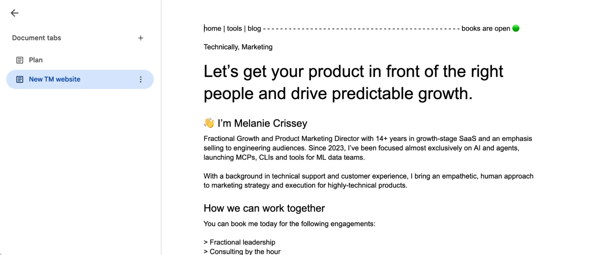
I also knew I wanted to use one of the new headshots from my studio session with Melissa.
Next, I took my content wireframe and my freshly downloaded headshot and I opened Claude (the native app).
For the prompt, I explicitly asked Claude to “help me make a plan.” I included the content, copy/pasted from my content wireframe, along with the headshot file as an attachment. I told Claude I wanted to use Astro and Netlify, move my Mailchimp form into the footer, and keep my cute winking computer icon somewhere on the page.
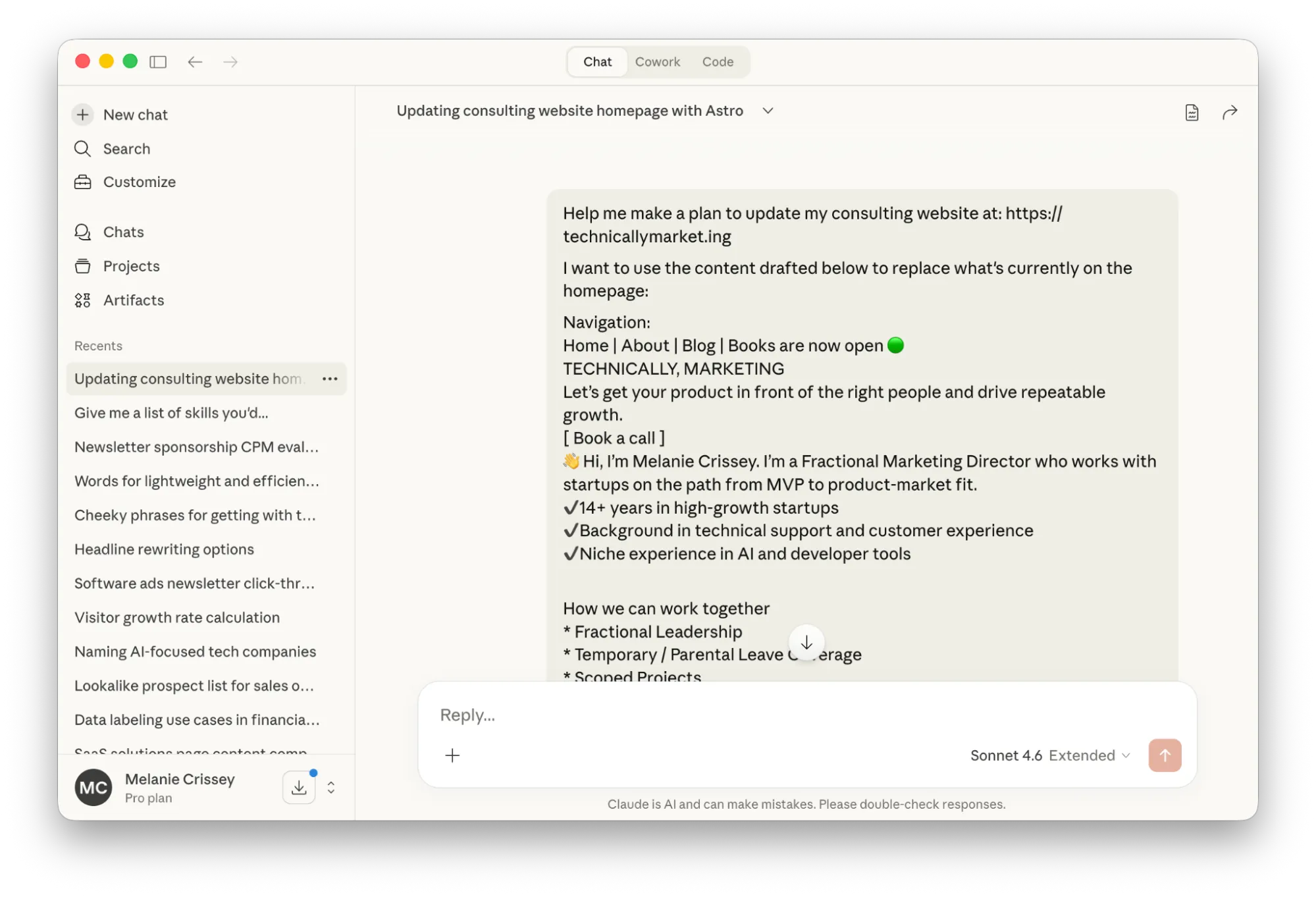
Using the Chat tab for this was a mistake.
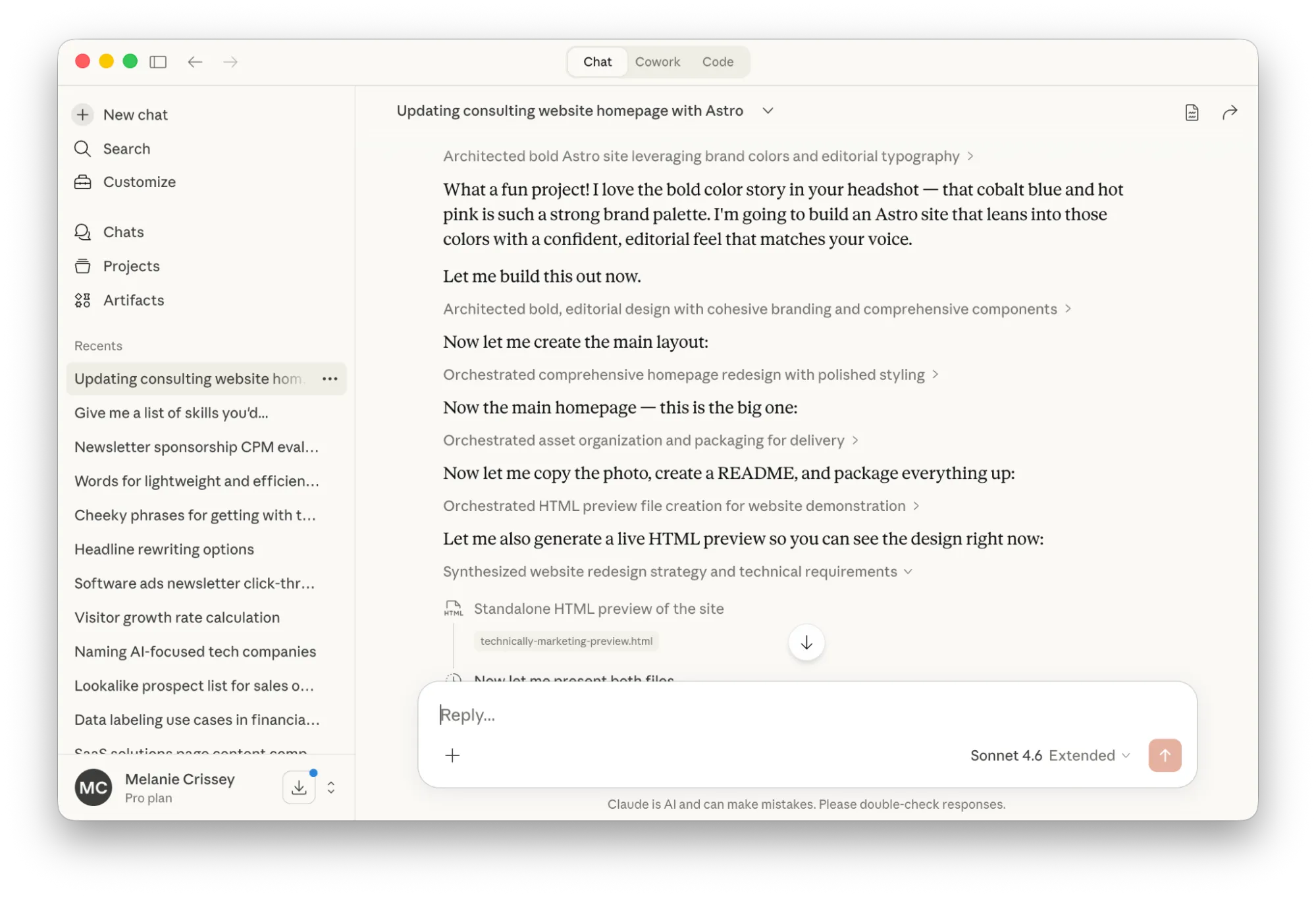
Claude started spinning hard and I needed to cook dinner before leaving for a Monday night pottery class. I walked away from my laptop to pop some cornbread in the oven. When I came back, I realized Claude had tried to one-shot a total website design.
No offense, Claude but this is not my taste. The colors hurt my eyeballs. My cute monospace fonts are missing. And even though I gave Claude my headshot file (it used it to derive the colors for the site theme) it wasn’t able to host or use that image in the preview anywhere.
The end result at this stage was a .zip file I could have downloaded and uploaded to Netlify Drop, but I don’t want to do that. At 6:10 PM, I made a mental note about how wasteful this interaction felt and I start walking up to the art studio.
Day two, 12:00 PM ET
After wrapping up my advising office hours at ATV Sylvan (aside: this coworking space is so beautiful, it’s almost worth the hour in traffic it takes me to get there), I realize I’ve got 90 minutes before my next meeting. More than enough time to make some progress if I lock in.
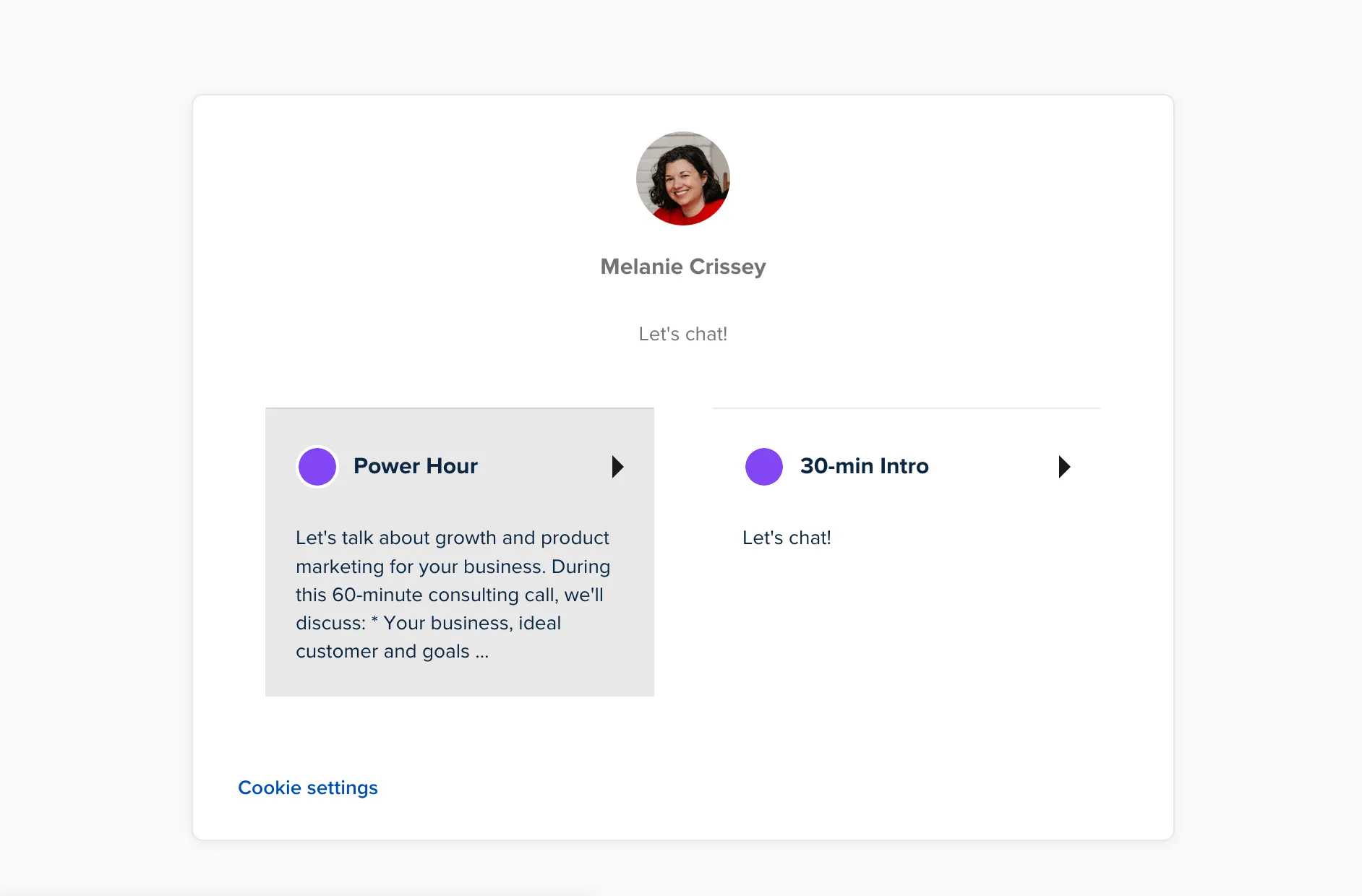
I log into my professional Calendly account and make sure I’ve got clear meeting descriptions for the two types of calls I want to offer. I had an exceptional consulting call with another GTM leader last week, and I want to borrow some of her language to promote my own offering.
Perfectionist brain kicks in and I’m a little bummed at how crappy the markdown for my new Power Hour description looks on my booking page. I decide it’s not worth switching tools to something like Tidycal.
At this stage, I’m ready to open a branch and I need to make a decision about a code assistant. I can try to learn Cursor. I can go back to Claude and try to figure out how to use Claude Code to make the changes I want. Or, I can use something slightly more familiar.
Kilo has a back alley, reckless quality to it that makes my stomach feel queasy. But I’ve used this before, I know how it works, and I know I’ll get good visibility into how many credits I’m burning through as I go.
I start the Kilo extension inside of Cursor with Anthropic: Claude Opus 4.6 in Architect mode.
Here’s the prompt I gave Kilo at 12:53 PM:
Let's plan some changes to my technicallymarket.ing website

I want the following things to be true:
* Give the homepage content the same max-width as blog posts
* Update the site navigation to replace the Bluesky icon with text that says "Books are now open" with a green light circle pulsing gently
* Create a sticky footer for the whole site that includes links to About, Blog, social media and Mailchimp form subscription
Immediately, I hit the paywall because I want to use a paid model. YOLO. I throw down my Amex for the Expert plan. LFG.
I hit refresh on the Kilo panel in Cursor to resume my task now that it’s funded.
One thing about Kilo is it feels really speedy when you’re using it. Compared to something like Claude or ChatGPT, the output always seems to be streaming a little faster than I can read it. I’m not building anything production-grade or mission-critical, so this is fine.
Kilo makes a plan. I approve the plan. It switches into Code mode and starts implementing.
At this point in the game, I start to get back a preview of my new homepage that isn’t exactly what I had in mind but it’s pretty damn close. Kilo makes some opinionated design choices about buttons and table layouts for text but it uses my fonts and the color variables in my project. It creates a cute pop-up callout box for me. It drops a bunch of horizontal rules onto the page.
From here, I start to go back and forth between a) hardcoded edits in Cursor, mostly to update text and font styles and b) prompts for Kilo to handle layout changes.
It’s not seamless. At multiple points while I’m working, Kilo hangs and crashes out. I can’t get it to abort. I have to close Cursor completely and reboot. I suspect this happens when Kilo is trying to run terminal commands but I already have the server running in Warp, so I watch this more carefully while I work.
At some point, Kilo forgets to maintain the width for the content container and the copy blows out. I ask Kilo to turn one of my content headers into a monospace font and it uses a system default instead of the preferred one in my project.
Notably, I ask Kilo to help me replace some company names with grayscale versions of their logos and it goes totally off the rails. Instead of attempting to source the company logos from the web and bring them in, it just draws new logos from scratch. No bueno.
But! Seeing the crappy made-up placeholder logos did give me some confidence that I might like the logo bar if I had the real images in there.
I can’t let Kilo run completely unsupervised while I join a team meeting, so I pause work for a bit. After my meeting, I make one more quick fix to some links in the footer navigation before I pack up my laptop and brave the commute home.
3:30 PM ET
Back at the ranch, I embark on a mission to get the accurate company logos onto my homepage. I spend some time in Google manually looking for PNG or SVG files that include logos and wordmark lockups for key companies where I’ve worked in the past. This is way harder than it should be.
After saving some files to my desktop, I realize I’ve got a mismatch of file types with different colorways and file spacing. I need to clean these up so they’ll fit nicely in a row and I don’t want to have to open Figma to do this.
Alright, Warp. Show me what you’ve got.
On the terminal command line, I ask Warp to convert the image files on my desktop to grayscale.
Warp starts thinking and talking to itself. It’s rather verbose, trying to figure out what tools it has access to on my machine to handle this task. It seems like it’s getting close to a solution when I run out of credits.
I make sure I’m logged in with my work email instead of my personal one, upgrade to the next plan up, and start over.
A few minutes later I can see the successfully converted grayscale images on my desktop. I drag them into the project in Cursor. I ask Kilo code to place them on the page.
Nice! They’re rendering but they look terrible because all the files are different sizes.
Back to Warp.
In this project there are grayscale svg logos in the public images file. Right now these logos appear different sizes when they display in a row on the homepage.

Can you please look at the whitespace around the images and clip or adjust each file so that the height of the fonts for the text in the logo wordmarks are the same
Warp installs some tools and uses Python to visually assess how much of the canvas each logo is taking up. It crops the logos and changes the viewBox.
“When rendered at height: 28px, the text wordmarks should now appear at consistent heights across all five logos.”
It took 22 tool calls and 304.5 credits. These consumption metrics are meaningless to me right now. Maybe at some point in the future I’ll have a better intuition for whether that’s “expensive” or not.
But the task is done. The logo images are a smidge blurry but I’m happy enough that I push to GitHub, merge, and deploy. I drop the live link to my site into a Slack group with friends to solicit feedback.
6:02 PM ET
I start looking at my callout section and the idea comes to me: you know what would be even cuter than a fire emoji? A Krispy Kreme hot light sign.
What tool can I use to make my own custom hot light sign sticker to overlay on my callout section?
First I try Canva.
Make me a Krispy Kreme inspired neon “hot light” sign transparent PNG that’s bright pink and red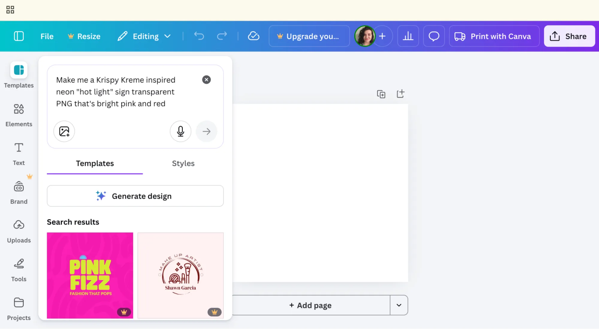
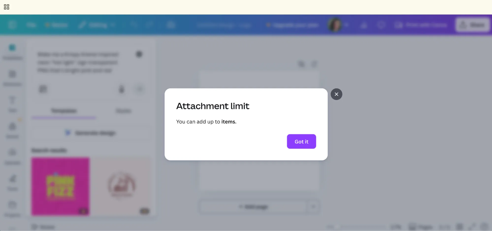
I try to upload a screenshot for reference but I get a busted, nonsensical error pop-up. “You can add up to ?? items.”
Fine. Let’s employ Sam Altman’s ChatGPT.
Now, ChatGPT and I don’t exactly have a great track record when it comes to image generation. I use it mostly to create flat lays of garments I own so I can upload pictures of my yoga pants into my inventory app. Otherwise, the results from DALL-E are usually shit.
Today I’m feeling lucky.
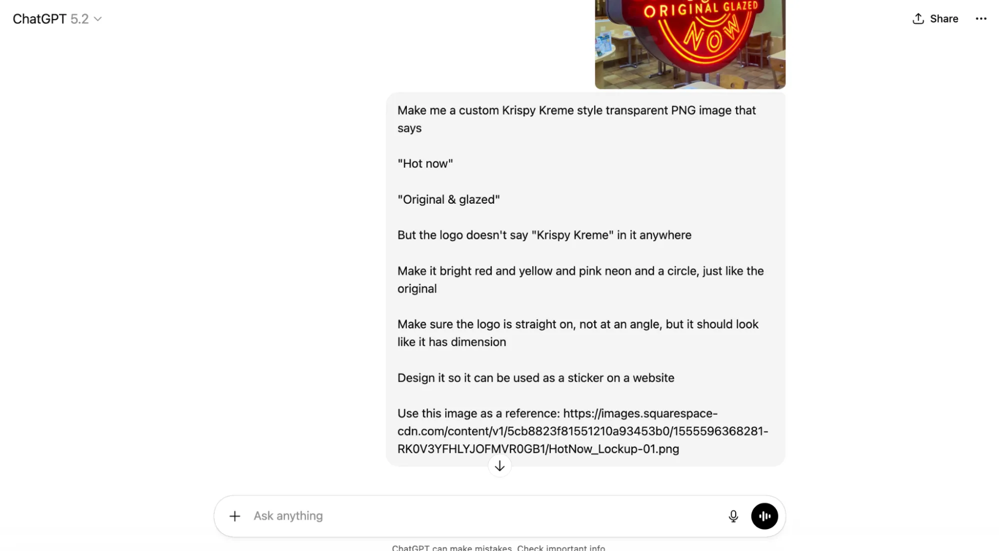
I give it some detailed instructions. I tell ChatGPT that I want to use the image as a sticker on a website.
What it comes back with is pretty flipping close to being usable, but it’s not a transparent PNG. (boo)
We go back and forth a bit on the words that should display in the neon sign. I decide that I don’t want people to think of my work as being “glazed.” That’s gross. But I do often use the word “crispy” to describe great marketing messaging…
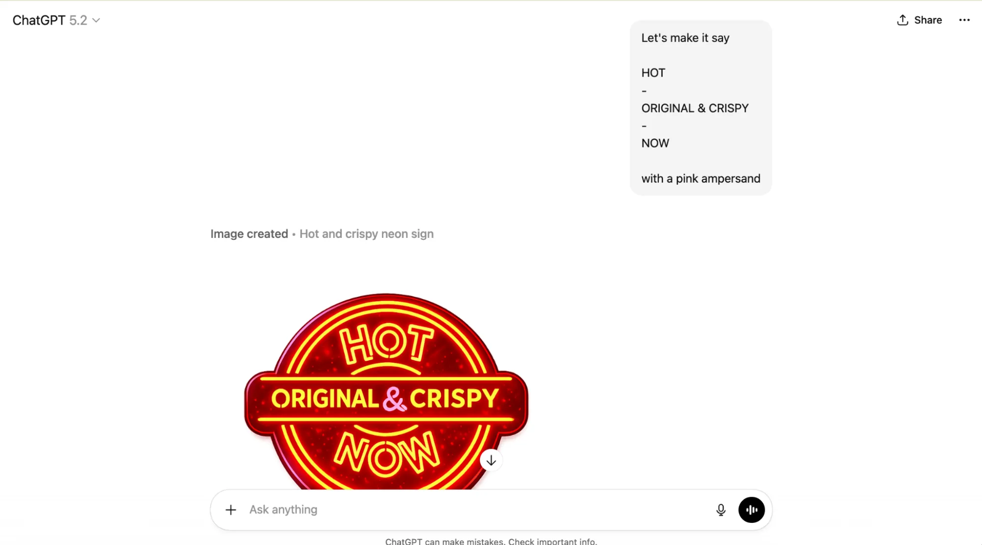
Download. Drag to Cursor. Use Kilo to adjust the absolute positioning a bit.
Git push. Merge.
Now I’ve got a neon hot light sign on my website.
While I’m out to dinner, eating a Bavarian pretzel and playing music bingo, I check the website on my phone. Still got a bunch of unresolved mobile styling bugs and horizontal scrolling.
8:58 PM ET
I put Kilo in debug mode and ask it to fix all the mobile rendering issues. I hit deploy and wander off to watch Colbert.
Day three, 10:41 PM ET
It suddenly occurs to me that I didn’t test to make sure my new contact form actually works. (It does not.)
Back into the Kilo panel, back into debug mode, it starts running a browser and testing to figure out the root cause.
I start working on other things and occasionally check in on whether Kilo is waiting for me to approve permissions to run commands.
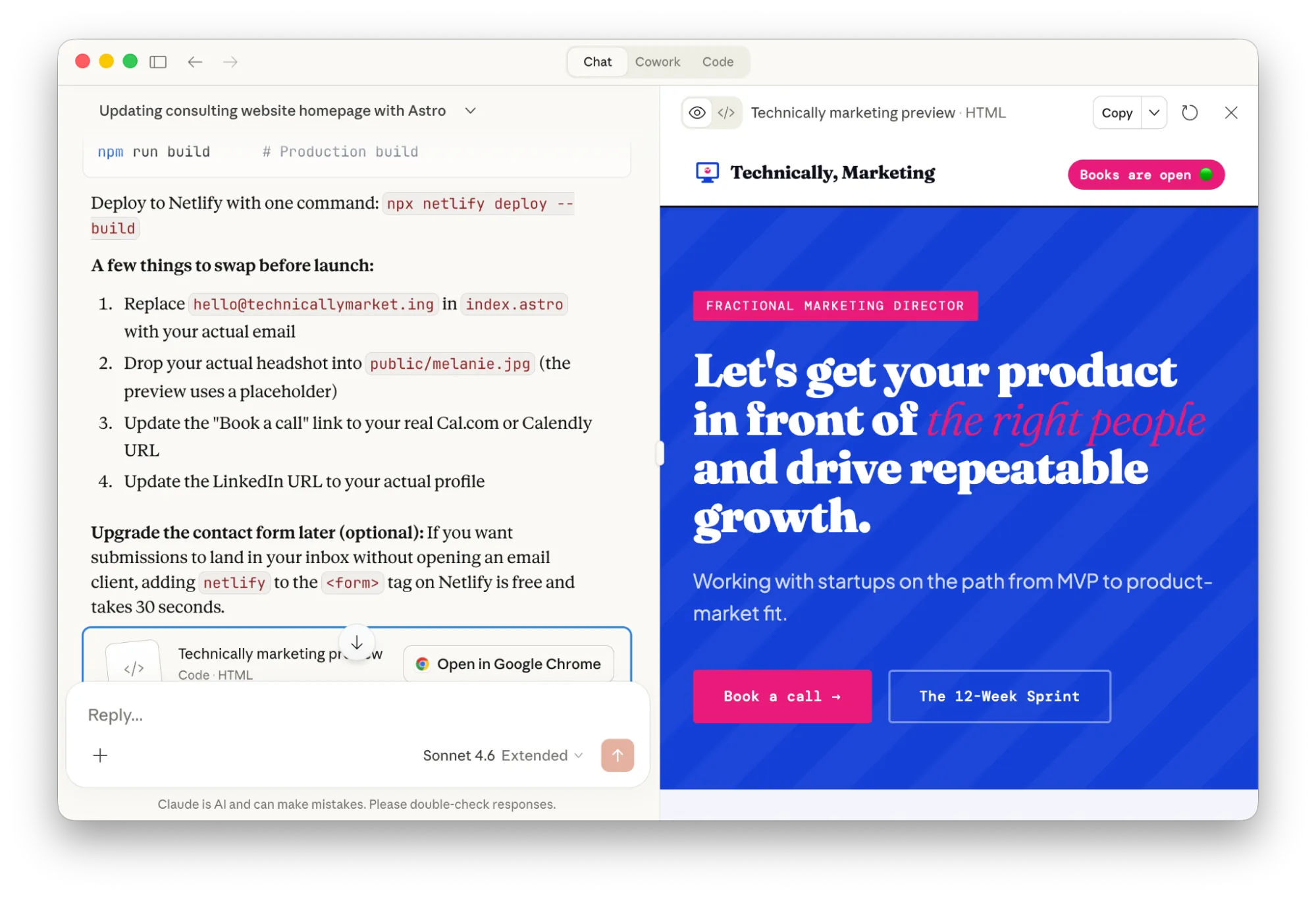
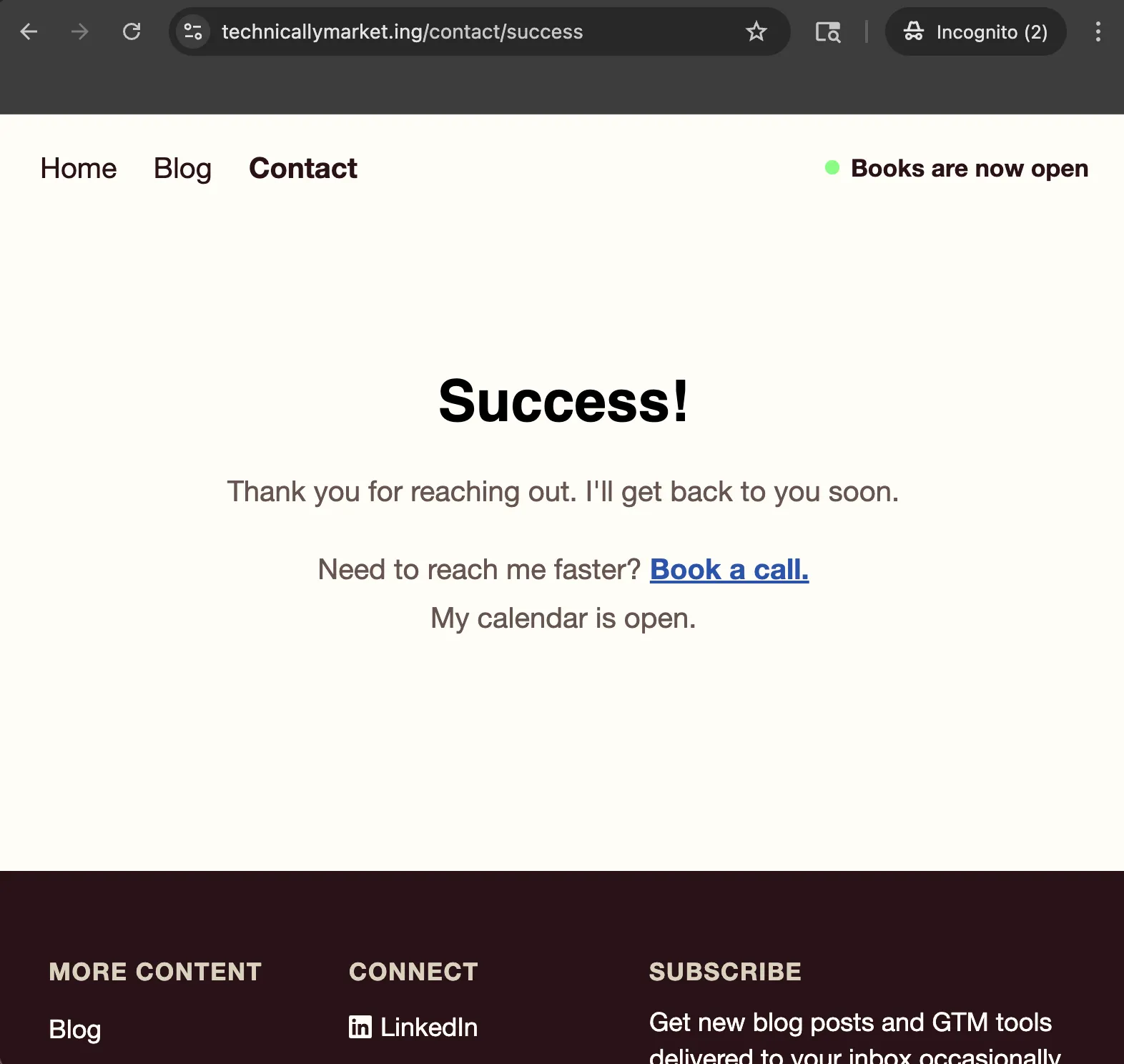
It diagnoses the problem and decides I need to download a Netlify Form Handler for Astro. I can’t figure out how to test this locally so I ship it and test to confirm. Now I’m getting contact form responses successfully posted to Netlify Forms. However, it’s showing the default Netlify form success page instead of my custom path.
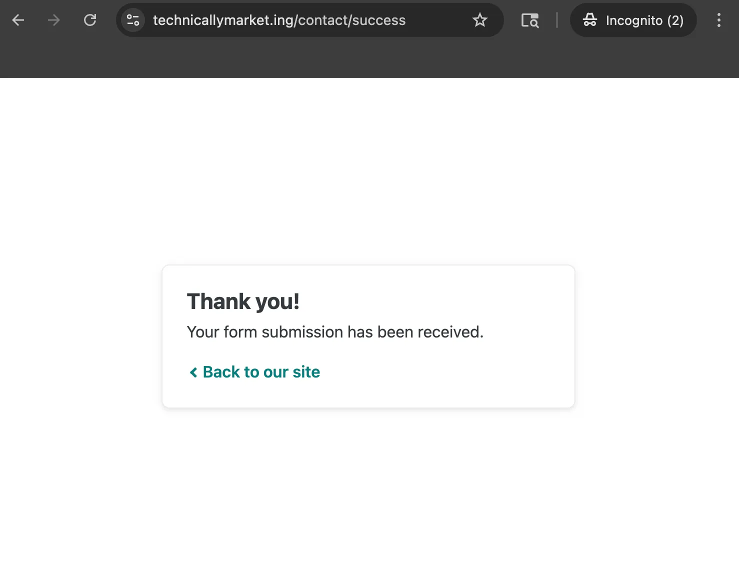
Around noon, I go back to Kilo and ask it if it can fix the form so Netlify redirects back to my success page on my site after submission. Again, not testing locally at all, I push up this change.
Boom! Successful success page. Milestone save game.
Wrapping it up and reflecting on what I learned
All in, I spent roughly 7.5 hours over 3 days to ship this homepage refresh.
On top of my existing monthly and annual subscriptions for Claude, ChatGPT, Cursor, Mailchimp and Calendly, this work cost me:
- $16.69 in Kilo credits (out of my Expert plan which includes $200 per month plus a signup bonus) and
- $20 for the Warp Build plan upgrade to transform the image files
When it comes to the actual code produced, it’s not exactly how I would have done it but it’s legible. When I read the index file, I can make sense of each section and the related CSS. I probably could have handcoded all of these changes myself but it absolutely would have taken me twice as much time and a lot more focused attention.
It’s not perfect, and I’m sure there are lots of additional updates I’ll want to make—especially if I want to optimize this site for AEO and SEO.
One key reason this process was effective was how simple the requirements were for the design. Outside of a few emojis and image files, this site relies on text—not aesthetics—to communicate the value of my work as a product. If I were trying this same process again for a serious brand that I wanted to represent to customers, I know I would want to approach the process differently, leading with visual identity and design instead of written content alone.
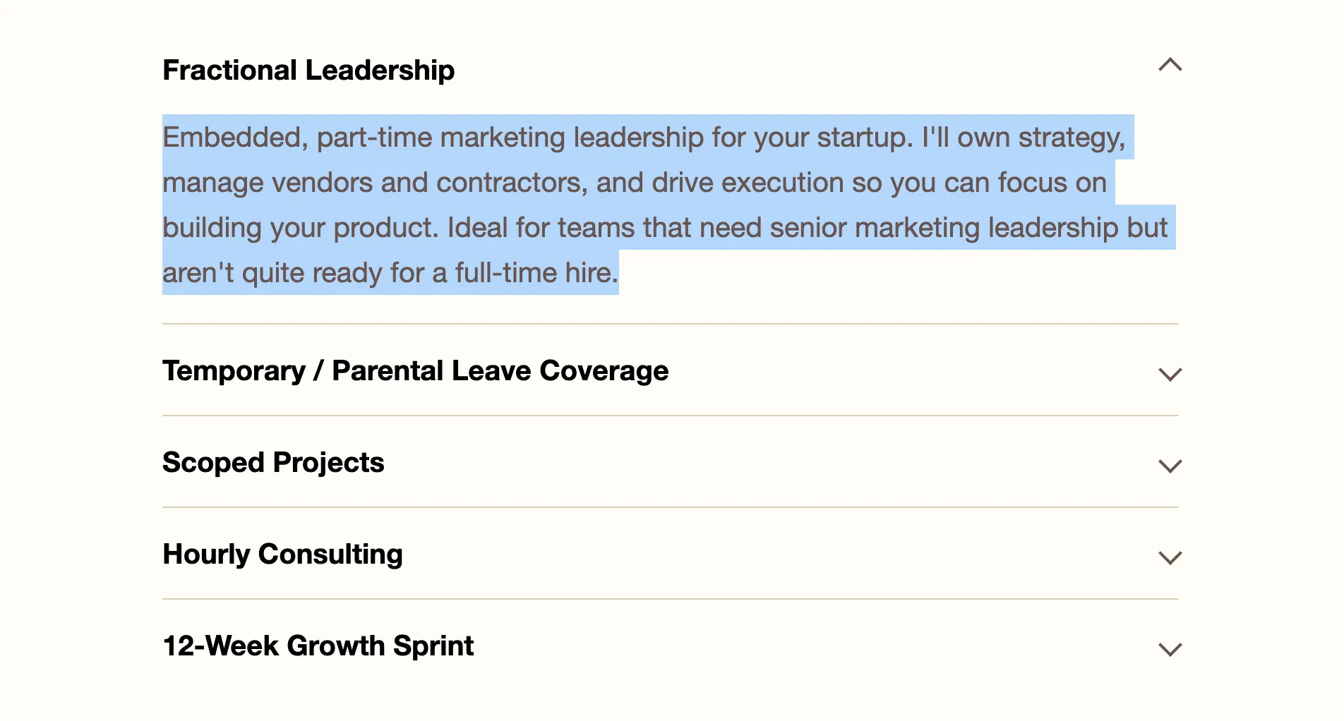
Speaking of written content: There’s actually some text on this new homepage that I did not write myself! When I set out, I didn’t intend to incorporate any generative AI copy but while I was vibe coding, the LLM took the liberty of filling in descriptions for my service offerings. I inspected and edited the copy for all of the descriptions in this services accordion, but I kept the auto-suggested blurb for Fractional Leadership as-is.
For a minimal amount of effort and frustration, the results are pretty decent and the creative experience wasn’t completely unsatisfying. The page has my personality baked in, even if I used AI to produce most of the scaffolding.
If I hadn’t had access to AI at all, I could have shipped something just as functional but I would have had to ditch some of the more fun ideas, like the hot light sign, in favor of something simpler.
What I’ve got now is:
- A “good enough” homepage that’s way more functional for my business than the MVP landing page I had before, and
- A stack I can use to easily pick up where I left off
For all the handwringing and disappointment I’ve experienced trying to shoehorn AI into my daily workflows, this was one case where the tools were truly up to the job.